Put data at the heart of your complex programs.
Program management is dynamic and complex – it’s much more than gates and checklists.
It’s about the people, what they do, how they’re organised and how they interact – all, are vital pieces of information to your programs success – or what could cause program delays and overspends.
It’s often forgotten that the people working directly on your program have a wealth of information into the true health of your business-critical program.
From program data to delivery insights
Accessibility of meaningful data and actionable insights increases the chances of your program succeeding and achieving its outcomes, first-time around.
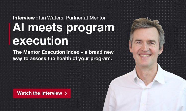
Watch the video and find out how The Mentor Execution Index uses modern survey and data analysis techniques to give you an objective assessment of the health of your program – using information collected from your team, customers and suppliers.
It provides a level of insight that leads to interventions and improvements that are not available from more traditional program tools.
The video will show you how It creates an x-ray of the true status of the program – what’s working and where the potential risks might lie.
Talk to one of our experts to find out more
Insights that can transform your program – watch the video
VIDEO TRANSCRIPT
How well do you know what’s going on in your program? Do you have a complete view of your business-critical program? Welcome to the Mentor Execution Index demo. A program assurance tool built on a unique combination of practical experience and the latest Artificial Intelligence.
The demo will see how the tool can help Executives and program teams quickly identify where they need to focus. See the potential risks – plan how to overcome them – and optimise performance. It goes well beyond the standard project management, task driven tools available on the market today.
The first step in assessing your program’s health and its performance is to gather valuable insights from your people, customers and suppliers. We do this by asking questions based on 6 critical execution success traits that Mentor has seen impact the delivery of all the programs we’ve worked on: Alignment Plans Organisation Suppliers Dependencies and Culture We use a Likert scale and free text fields to collect and measure responses.
Once the surveys have been completed the tool aggregates and interprets the information. It creates an x-ray of the true status of the program – what’s working and where the potential risks might lie. The analysis is completed using a specially designed algorithm, the latest artificial intelligence including machine learning and natural language processing. To access the results, enter your unique log-in details and sign in.
The first dashboard screen you see shows a high-level view of how the program is performing alongside a list of smart dashboards options on the left. Each dashboard gives a different quantitative measure of the program’s performance based on the survey responses. Showing differences and consistencies between teams and highlighting possible issues.
As we run through the demo you’ll see an Insight section on screen – this is Mentor’s interpretation of the results and our expert opinion on what is driving your program’s performance. So, what’s this view telling us? This first screen gives a snap-shot of how the program team and executive team see the Program, along with the score they need to be successful. It demonstrates whether a program is falling short of what is required.
In this example it’s clear that there are big differences between what the Executive team thinks and what the program team thinks. Early indications show that improvements are needed to make sure the Program delivers on its objectives. I’ll show you what’s driving the numbers using the dashboard options on the left.
The gap analysis dashboard leads you through a more detailed assessment of where your program is currently and where you need to be – it helps you to act on facts, not assumptions. By building the chart up and scrolling over each datapoint you can see the exact scores for the program team and the Executive team against each trait being measured. In this example the most significant gaps are between Alignment and Organisation, with similar views being held on Culture and Suppliers.
The trait analysis dashboard drills down into these scores. It makes connections between data sets, painting a picture of what’s really going on in the program against each of the 6 traits. Two views are available – the aggregated view, that we see on screen now which gives you a complete picture of all the participants scores. The closer the lines the greater the consensus. We are also interested in the outliers, where there are differences of opinion as well as the overall scores by trait. And the participant view.
By using the filters on the right-hand side, you can get richer insights by demographic, for example by department or function, team, location or even the length of time at the company. Helping you pinpoint strengths and challenges across your program in greater detail. You’ll notice how the graph changes as I choose a different filter. The filters can be customised to your individual company or program requirements.
You can take this examination a step further by using the filter button below the graph to breakdown the scores by program trait. Once again you can go into each trait and get more detail by using the filters on the right-hand side.
The question analysis dashboard shows you the detail behind the scores for each question asked in the survey. It provides a number of different ways of filtering the scores – by Average, Mode, Median and Standard Deviation. This dashboard allows you to look in the greatest detail providing scores of individual questions – each question asked has a particular relevance which would be missed if you only considered the 6 traits.
And finally, the quote analysis dashboard. This shows the written feedback collected from the survey. It focuses on the qualitative comments collected from the free text fields – quickly showing you the themes and providing context for the scores collected. Using natural language processing it highlights common words, themes and sentiment and looks for strength and weaknesses in the answers given. It adds a unique and valuable insight that would not have been picked up from the survey questions alone.
We’ve come to the end of the demo and I hope it’s given you a good understanding of how The Mentor Execution Index removes the ambiguity and subjectivity of a program’s status to give a more meaningful picture and clear actions that lead to greater execution success. Find out how the tool can help your program succeed by visiting our website.
Benefiting from the latest technology for program success
With meaningful insights and the right program management expertise there is no reason why your program won’t succeed.

Speed
Quick, cost effective, confidential and broad
Comprehensive assessment and recommendations delivered in a matter of weeks
Accelerates the review process and eliminates costly re-plans

Efficiency
Successful program delivery built on fact-based insights that can’t be challenged
Ongoing assessment and indexing against others
Build a program-ready organisation, using insights from across the organisation

Certainty
Actionable analysis based on a proven program execution framework – The MentorBlueprint
Achieves results using qualitative and quantitative data
Uses proven AI, algorithms and analytics from leading data science experts
The Mentor Execution Index featured content
Find out more about how The Mentor Execution Index combines program management expertise with the latest technology to deliver better program outcomes.
Read the guide and find out about the 6 balls that you can’t afford to drop for program execution success.


